Sharp Design
InventionHome
Website Redesign
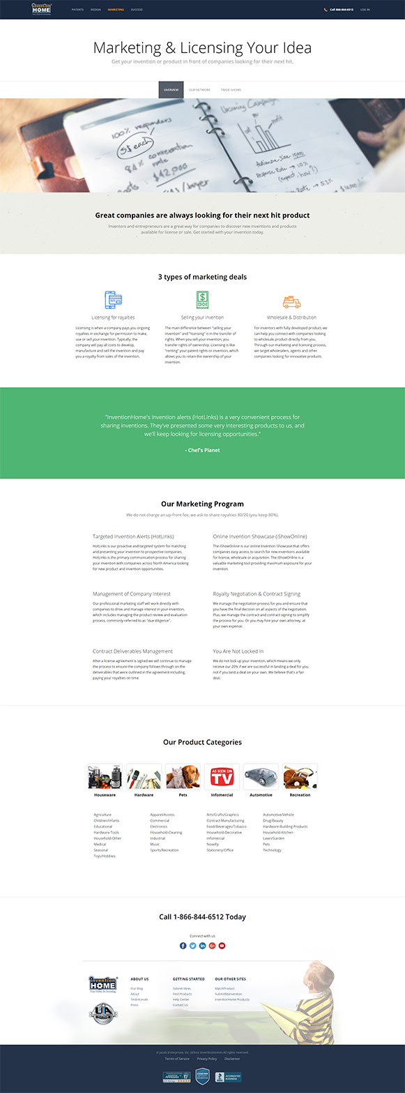
This redesign was for an online marketing firm that relies heavily on brand image to build trust and make sales. The goal was to create a website that was effective at getting their sales points across clearly and presented the company's successes.
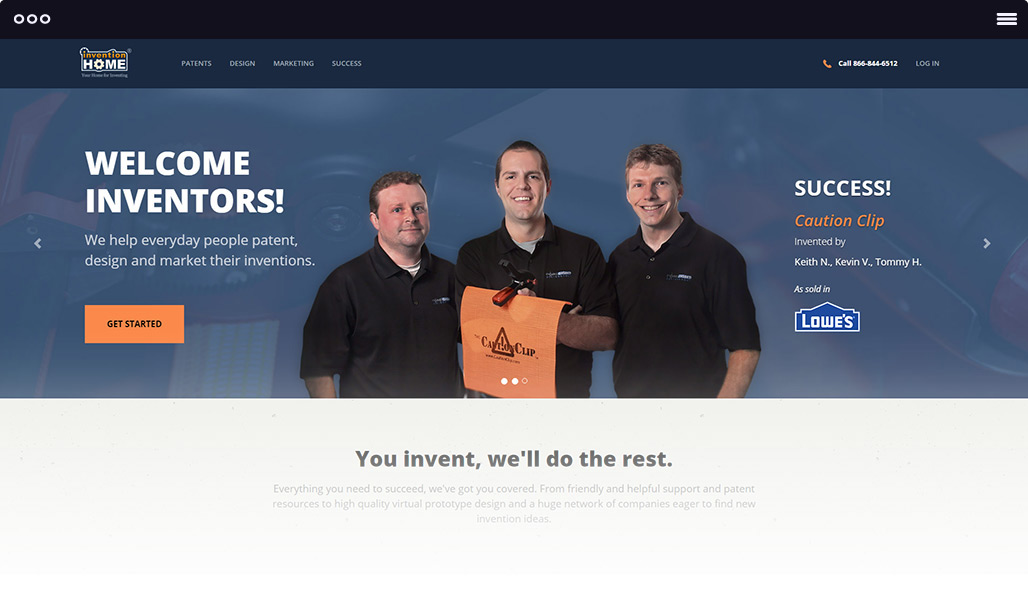 View live website
The Problem
The invention marketing industry is very competitive and conversion rates can determine a company's success. InventionHome relies on advertising and their costs were getting too high. The website wasn't selling well enough.
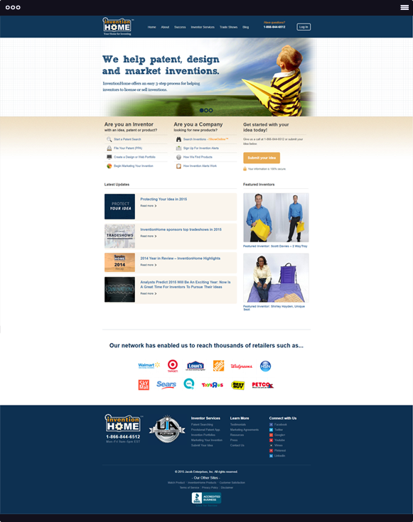
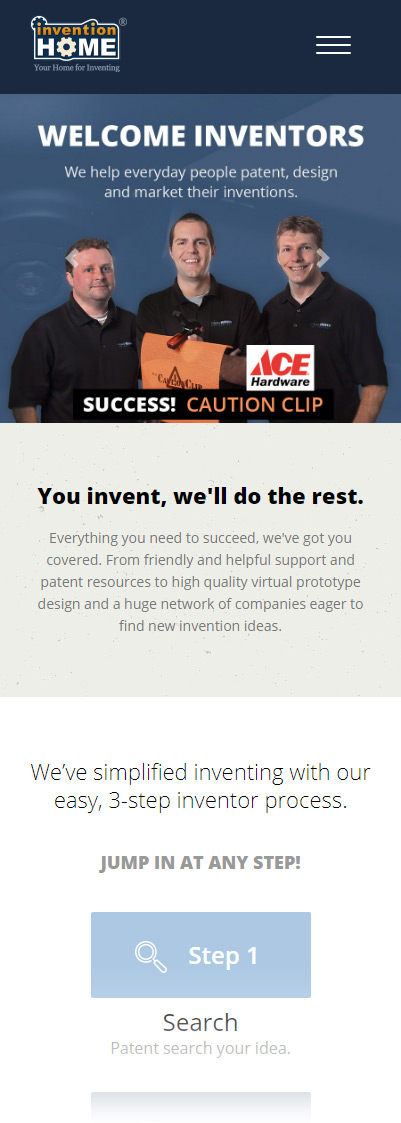
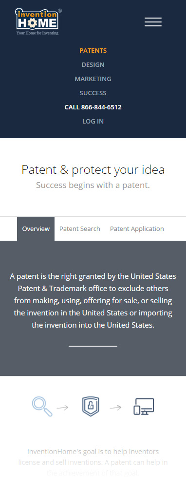
The pages were cluttered, it was hard to pick out the important selling points from things around them that weren't relevant. The design looked dated. Plus, their website was completely incompatible with mobile devices, despite that their data said more than half of their web traffic was from phones.
The Solution
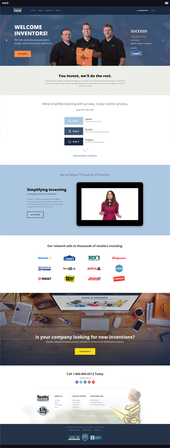
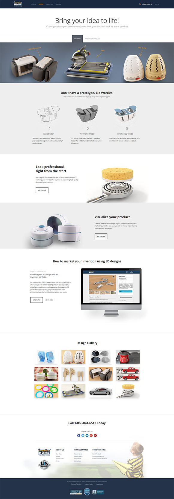
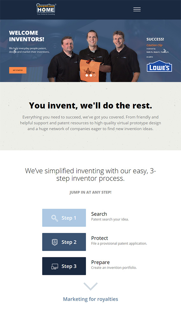
We were able to boil down the key things that were most important for potential customers to take away. We cut out anything that didn't further that message, making it easier to sell their services.
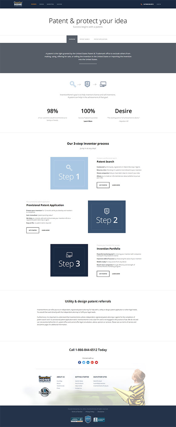
I focused on building up their examples of real customers that have succeeded and laying out their process so people could clearly see how InventionHome's services could help them.
The modern design was done for both desktop and mobile devices and coded to load quickly.
The Results
The amount of time that people spent on the website before leaving increased by around 40%, even more with mobile visitors.
The total number of call-ins increased as well.
Most importantly, sales conversion rate jumped up by 15%. This brought down the cost per lead significantly, which is what was most important from the beginning.
