Sharp Design
my Sports Resume
Website & User Dashboard
This non-profit startup was a complex job requiring a wide range of solutions. With a sales focused homepage, a user dashboard backend and a front end user profile template, this job was really like three websites in one, which made it vital to maintain a consistent flow.
 View live website
The Homepage
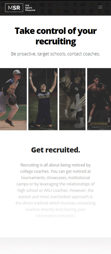
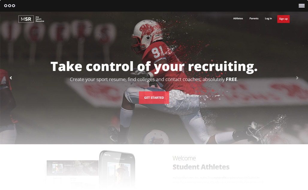
This was the first of the three website parts. It serves as the landing page and provides information with the goal of having athletes sign up.
I kept things brief and put the focus on the sign ups. The other pages just serve their purpose of education the visitor on what the service is.
The Dashboard
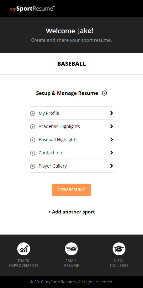
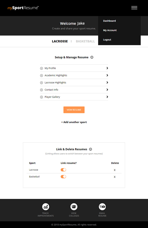
This was a complicated piece. It was designed mobile first, as kids would likely be checking their accounts on their phone mostly.
The goal here was to make sure nothing was confusing and include just as many pages and settings to manage the resume.
The Resume
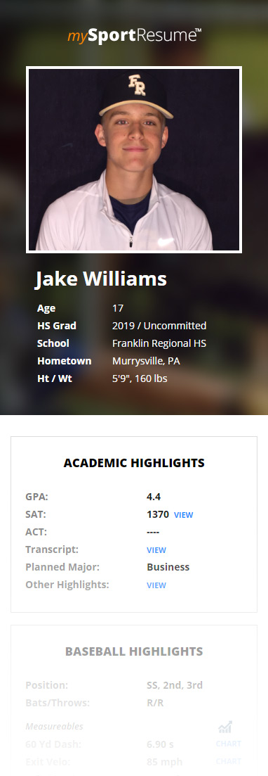
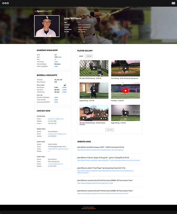
This was basically a template that all of the athlete's data would be shown in. It had to look share-worthy and display everything great on mobile.
We build several default backgrounds to choose from as well as an option to upload and crop your own. The chart pop ups are a unique stylish bonus.
Mobile versions
