Sharp Design
Western PA Referees
Website Redesign
This local nonprofit was having some serious issues with user experience on their old website. Their many users were becoming increasingly frustrated with how hard it was to find what they needed. I stepped in to completely redo the website with a clean, straightforward approach.
 View live website
The Problem
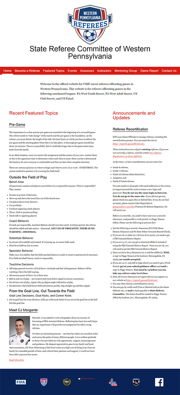
If you look at the before image, you'll see that there was an overwhelming amount of text with no focus whatsoever. The purpose of the website was to encourage people to become referees as well is provide information on how to do so, but it was very hard to find what you were looking for, to the point that it was actually counterproductive to their goals.
On top of this, they wanted a calendar and notification feature so people could tell when classes and tests were going to be happening.
The Solution
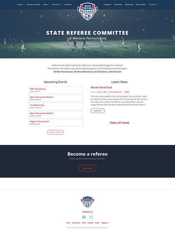
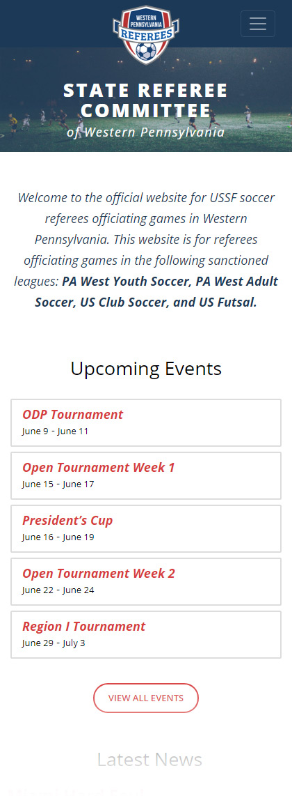
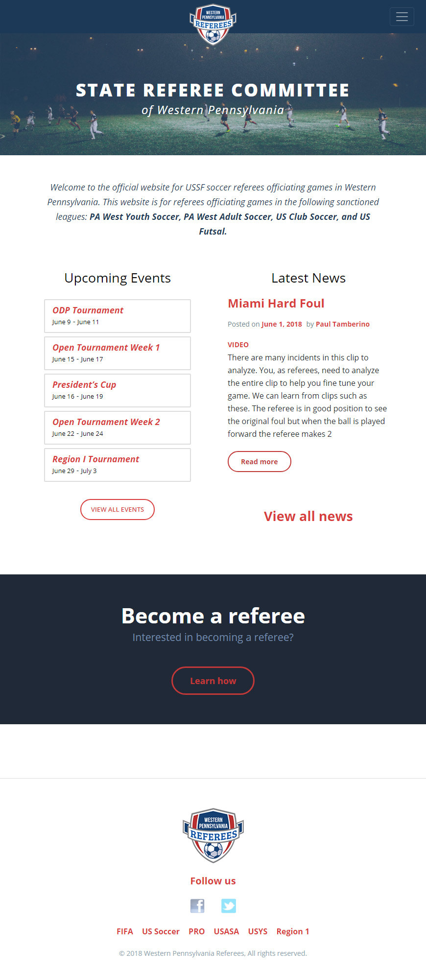
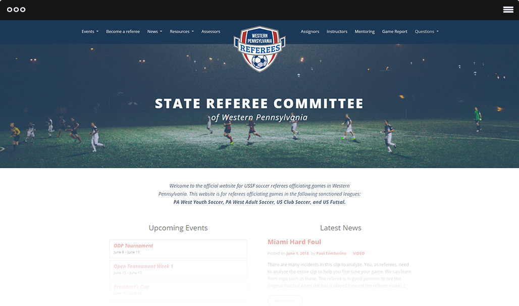
I designed the new homepage to do specifically what was important to them: keep people informed of events and serve as a portal to learn how to become a referee.
A separate section pointing to the first step in the process (Become a referee) serves as their call to action and the news and events serve the information that is important to anyone who already is a referee.
The Results
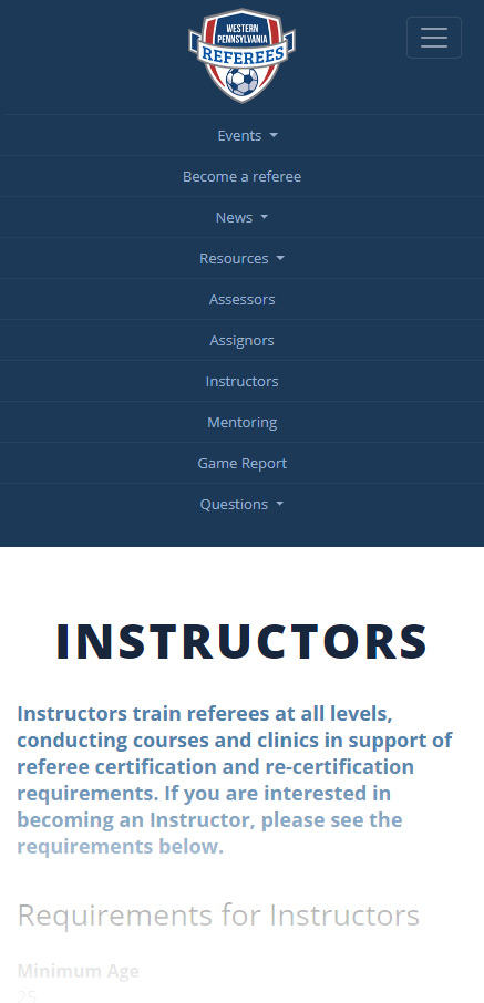
The clean, simplified approach let people find what they needed much more easily. Classes are now the main focus for people in the process of refereeing and the information about what's required to become a referee is easy to find and understand.
The built in content management system (WordPress) allows them to update the website whenever they want. Now they can quickly add new events, articles, classes and change any information when it becomes outdated.
